How to Build a Custom Input with Dropdown Component in Shadcn/ui
How to Build a Custom Input with Dropdown Component in Shadcn/ui
Suraj Vishwakarma
Updated
Originally Published
Navigation Map
TL;DR
ShadCN has become my go-to component library for building components, just like many developers today. Rather than a component library, it is a “copy-and-paste" code into your app. Having the source code at hand allows for customization as needed.
Multiple components are there in the Shadcn pre-built library. However, as you built a complex application, you will need some components that are not in the Shadcn/ui. I faced one of these when I needed an Input field that is tightly coupled with a Dropdown to select a value. You could place an Input and a Select side-by-side, but they often feel disconnected. What we really want is a single, cohesive component. I built a custom component for this issue, as you can see in the image below.

Today, we're going to build exactly that: a generic, reusable InputWithDropdown component.
The Goal
Let’s first describe all the features that we are going to implement in this.
- It should look like a normal
Inputcomponent - It should have a Trigger Button attached to either the start or the end as per the requirement.
- Clicking the button should open the dropdown. Here we are going to use the
PopoverandCommandShadCN component as it offers a search facility and all. - It's built entirely from
shadcn/uiprimitives, making it feel native to anyshadcn/uiproject. - Since it is a component, it should act like a component, such as being reusable with any data.
The Final Code
Let’s start with the final code first. After that, we can discuss the anatomy of the code:
    "use client";
    import * as React from "react";
    import { cn } from "@/lib/utils";
    import {
      Command,
      CommandInput,
      CommandEmpty,
      CommandGroup,
      CommandList,
      CommandItem,
    } from "@/components/ui/command";
    import { Input } from "@/components/ui/input";
    import { Button } from "@/components/ui/button";
    import {
      Popover,
      PopoverContent,
      PopoverTrigger,
    } from "@/components/ui/popover";
    import { ChevronDown, Check } from "lucide-react";
    const InputWithDropdown = ({
    className,
      endList,
      onSelect,
      selectedValue,
      name,
      type,
      error,
      helperText,
      disabled,
      listPosition = "end",
      searchPlaceholder = "Search...",
      emptyListMessage = "No items found.",
      startIcon,
      endIcon,
      helperTextClassname,
      outerClass,
      startIconClass,
      buttonClassName,
      ...props
    }: any) => {
      const [open, setOpen] = React.useState(false);
      const [search, setSearch] = React.useState("");

      const selected = endList?.find((val: any) => val?.id === selectedValue);
    const filteredList = React.useMemo(() => {
        if (!search) {
          return endList || [];
        }
        return (
          endList?.filter((item: any) =>
            item?.name?.toLowerCase()?.includes(search.toLowerCase())
          ) || []
        );
      }, [endList, search]);

      const stopWheelEventPropagation = (e: any) => {
        e.stopPropagation();
      };
      const stopTouchMoveEventPropagation = (e: any) => {
        e.stopPropagation();
      };
      return (
        <div className={cn("w-full relative", outerClass)}>
          <Input
            type={type}
            startIcon={startIcon}
            startIconClass={startIconClass}
            disabled={disabled}
            className={cn(
              "flex h-[32px] w-full rounded-md border border-slate-200 bg-transparent px-3 py-1 text-sm shadow-sm transition-colors file:border-0 file:bg-transparent file:text-sm file:font-medium placeholder:text-slate-500 focus-visible:outline-none focus-visible:ring-1 focus-visible:ring-primary disabled:bg-[#F4F4F4] disabled:cursor-not-allowed disabled:opacity-80 dark:border-slate-800 dark:placeholder:text-slate-400 dark:focus-visible:ring-slate-300",
              startIcon ? "pl-5" : "",

              endIcon || (endList && listPosition === "end") ? "pr-24" : "",
              listPosition === "start" && endList ? "pl-24" : "",
              error ? "border-red-600 focus-visible:ring-0" : "",
              className
            )}
            {...props}
          />
          {endList && (
            <div
              className={cn(
                "absolute top-1/2 transform -translate-y-1/2",
                listPosition === "start" ? "left-[1px]" : "right-[1px]"
              )}
            >
              <Popover
                open={open}
                onOpenChange={(val) => {
                  setOpen(val);
                  if (!val) {
                    setSearch("");
                  }
                }}
              >
                <PopoverTrigger asChild>
                  <Button
                    variant="outline"
                    role="combobox"
                    className={cn(
                      "w-[85px] h-[30px] px-2 focus:ring-0 focus-border-none rounded-none",
                      listPosition === "start"
                        ? "rounded-tl-md rounded-bl-md"
                        : "rounded-tr-md rounded-br-md",
                      "border-none bg-[#F4F4F5] hover:bg-[#F4F4F5] justify-between disabled:opacity-80 disabled:cursor-not-allowed",
                      buttonClassName
                    )}
                    onClick={(e) => {
                      e.stopPropagation();
                    }}
                    disabled={disabled}
                  >
                    <div className="flex justify-between items-center overflow-hidden w-full gap-1">
                      <p className="m-0 text-start font-ttHoves text-[#27272A] text-sm font-medium truncate">
                        {selected?.name || "-"}
                      </p>
                      {!disabled && <ChevronDown className="h-4 w-4 shrink-0" />}
                    </div>
                  </Button>
                </PopoverTrigger>
                <PopoverContent
                  className="w-[200px] p-0"
                  onEscapeKeyDown={() => setOpen(false)}
                  onWheel={stopWheelEventPropagation}
                  onTouchMove={stopTouchMoveEventPropagation}
                >
                  <Command>
                    <CommandInput
                      placeholder={searchPlaceholder}
                      className="h-9"
                      onValueChange={setSearch}
                      onClick={(e) => e.stopPropagation()}
                    />
                    <CommandList className="max-h-[200px] overflow-y-auto">
                      <CommandEmpty>{emptyListMessage}</CommandEmpty>
                      <CommandGroup>
                        {filteredList.map((item: any) => (
                          <CommandItem
                            key={item.id}
                            onMouseDown={(e) => {
                              e.preventDefault();
                              e.stopPropagation();
                            }}
                            onSelect={() => {
                              onSelect(item?.id);
                              setOpen(false);
                            }}
                          >
                            <div className="flex justify-between w-full items-center">
                              <p className="my-0">{item.name}</p>
                              {selected?.id === item?.id && (
                                <Check className="h-4 w-4 text-[#F08B32]" />
                              )}
                            </div>
                          </CommandItem>
                        ))}
                      </CommandGroup>
                    </CommandList>
                  </Command>
                </PopoverContent>
              </Popover>
            </div>
          )}
          {error && helperText && (
            <p
              className={`absolute left-0 bottom-[-20px] text-[8px] mx-2 mt-1 text-red-600 ${helperTextClassname}`}
            >
              {helperText}
            </p>
          )}
        </div>
      );
    };
    InputWithDropdown.displayName = "InputWithDropdown";
    export { InputWithDropdown };
Breaking the Code
This component might look complex, but it's just a clever combination of three core shadcn/ui primitives. Understanding how they fit together is the key.
- The Base
**Input**: Everything starts with a standardInput. The trick is to use CSS padding (pr-24orpl-24) to create empty space on one side. This is where our dropdown button will live, making it look like it's part of the input. - Absolute Positioning is Key: The
Inputand thePopoverare wrapped in adivwithposition: relative. ThePopoveritself is then placed inside a container withposition: absolute. This allows us to overlay the dropdown button perfectly inside the padded area of the input. - The
**Popover**as a Dropdown: We use aPopoverto handle the show/hide logic.**PopoverTrigger**: This wraps ourButton. When the button is clicked, the popover opens. We style this button to seamlessly blend with the input field.**PopoverContent**: This is the floating container for our dropdown list.
- The
**Command**for a Searchable List: Inside thePopoverContent, we nest theCommandcomponent. This instantly gives us a powerful, accessible, and searchable list with minimal effort. It's the perfect tool for creating a user-friendly dropdown menu.
Props Usage: Making It Reusable
The component's reusability comes from its flexible props. Here is a detailed breakdown of the primary API:
| Prop | Description |
|---|---|
endList | An array of objects used to populate the dropdown. Each object must have an id and a name property. |
onSelect | A callback function that fires when a user selects an item. It receives the selected item's id as its only argument. |
selectedValue | The id of the currently selected item. Passing this prop makes InputWithDropdown a controlled component. |
listPosition | A string that determines where the dropdown button appears. Accepts 'start' or 'end'. Defaults to 'end'. |
disabled | A boolean that, when true, disables both the text input and the dropdown button. |
searchPlaceholder | Custom placeholder text for the search input inside the dropdown menu. Defaults to 'Search...'. |
emptyListMessage | The message to display within the dropdown when a search yields no results. Defaults to 'No items found.'. |
...props | Any other standard Input props (like value, onChange, placeholder, type, etc.) are passed directly to the underlying Input element. |
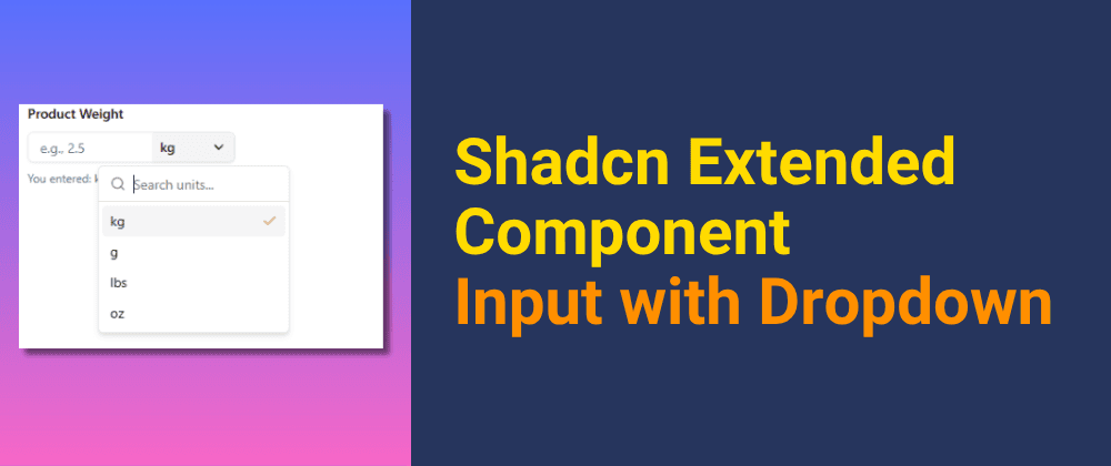
Working of the Component
You can use the above-created in the real world with the below example.
    import * as React from 'react';
    import { InputWithDropdown } from '@/components/ui/input-with-list';

    const weightUnits = [
      { id: 'kg', name: 'kg' },
      { id: 'g', name: 'g' },
      { id: 'lbs', name: 'lbs' },
      { id: 'oz', name: 'oz' },
    ];

    export function ProductWeightForm() {
      const [weight, setWeight] = React.useState('');
      const [unit, setUnit] = React.useState('kg');

      return (
        <div className="w-64 space-y-2">
          <label htmlFor="weight" className="text-sm font-medium">
            Product Weight
          </label>
          <InputWithDropdown
            id="weight"
            type="number"
            placeholder="e.g., 2.5"
            value={weight}
            onChange={(e) => setWeight(e.target.value)}
endList={weightUnits}
            selectedValue={unit}
            onSelect={(selectedId) => setUnit(selectedId)}
            listPosition="end"
            searchPlaceholder="Search units..."
          />
          <p className="text-xs text-slate-500">
            You entered: {weight} {unit}
          </p>
        </div>
      );
    }
You can find the resources related to this below:
- Code: https://github.com/surajondev/Extended-Shadcn-Components/blob/main/components/ui/input_with_dropdown.tsx
- CodeSandBox for live working: https://codesandbox.io/p/devbox/4w6qgz
Connect with Me🚀
Let's connect and stay informed on all things tech, innovation, and beyond!
Also, I am open to writing freelance articles if you are interested; then contact me via email or social media.
Conclusion
By using the different components of ShadCN, we were able to create another component that is reusable. It fits perfectly with the shade ecosystem.
Feel free to copy this component, adapt it to your needs, and make it a part of your own design system.